A meticulously crafted, responsive clone of the official Supabase landing page, rebuilt from the ground up as an advanced learning exercise and demonstration of modern frontend development practices. This project showcases the ability to recreate complex, production-grade marketing websites while maintaining performance, accessibility, and visual fidelity.
Project Overview
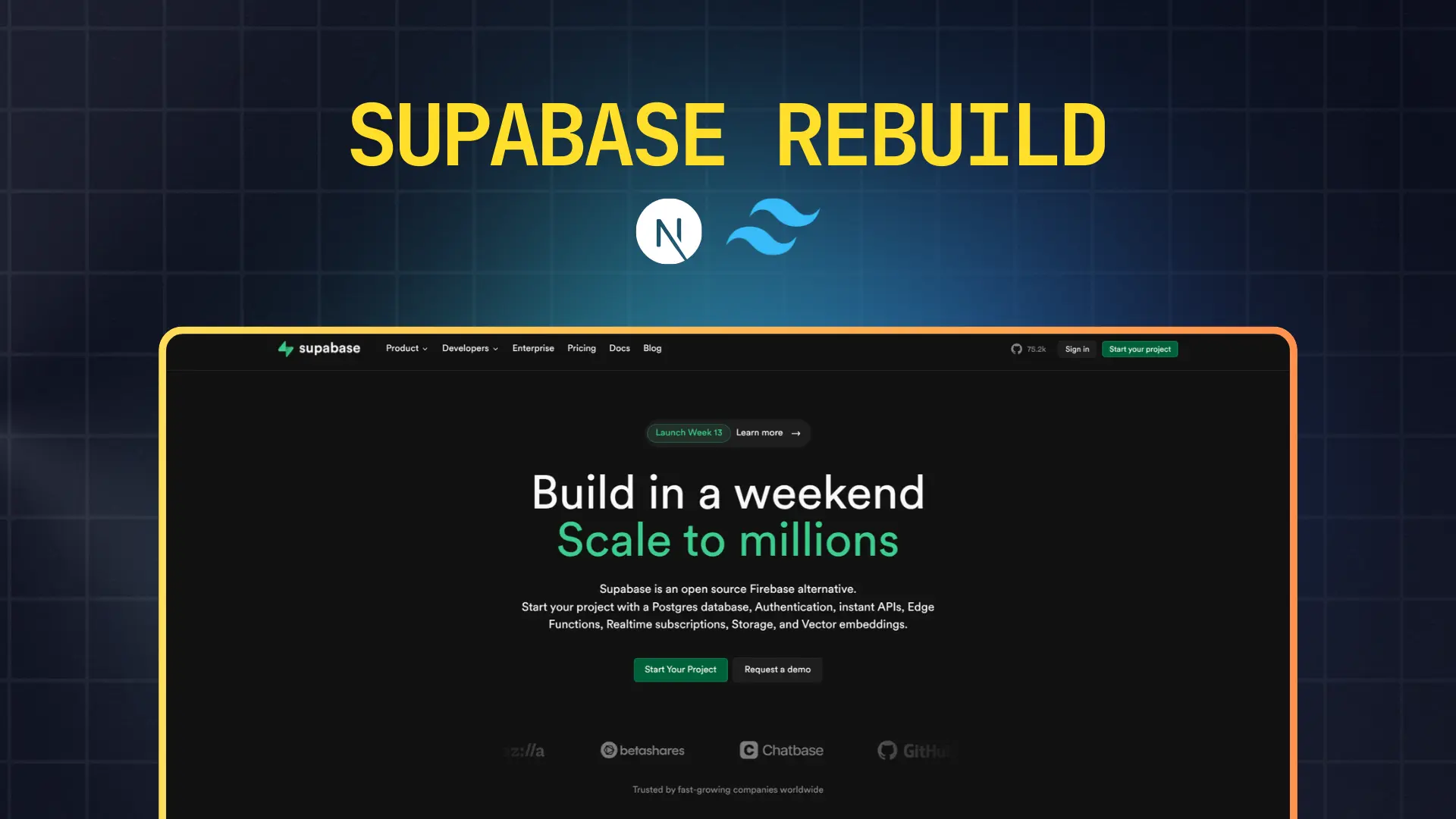
This project is a comprehensive frontend recreation of Supabase's marketing website, one of the most visually impressive landing pages in the modern developer tools space. Supabase is renowned for its bold design language, striking use of gradients, and sophisticated animations, making it an excellent challenge for frontend developers looking to level up their skills.
What Makes This Project Unique
Unlike simple landing page templates, this rebuild required careful analysis of Supabase's intricate design system, including their distinctive dark theme, vibrant green accent colors, and complex animation sequences. Every section has been thoughtfully reconstructed to capture the original's energy and professionalism.
The project emphasizes not just visual accuracy but also technical excellence, demonstrating proficiency with modern React patterns, animation libraries, and responsive design principles that are essential for professional web development.
Design Philosophy & Approach
Visual Recreation: This clone captures Supabase's signature aesthetic including their bold typography, gradient backgrounds, glowing effects, and smooth transitions. The color palette faithfully reproduces their brand colors with particular attention to the iconic Supabase green.
User Experience Focus: Every interactive element includes appropriate hover states, focus indicators, and smooth transitions that make the interface feel polished and professional.
Performance Consciousness: Despite the visual complexity with gradients and animations, the project maintains excellent performance through optimized rendering strategies and efficient component architecture.
Code Organization: The codebase follows best practices for component structure, making it easy to understand, modify, and extend for future enhancements.
Detailed Feature Breakdown
Navigation System
The navigation bar implements Supabase's clean, modern header design with strategic menu organization. The header includes primary navigation items for Product, Developers, Solutions, Pricing, Docs, and Blog sections, each positioned for optimal information architecture.
Desktop Navigation: Features a horizontal menu bar with subtle hover effects that highlight active sections. The logo area includes Supabase's distinctive branding, while the right side houses authentication CTAs and a prominent "Start your project" button with gradient styling.
Mobile Navigation: Transforms seamlessly into a hamburger menu system with a full-screen overlay that slides in from the right. The mobile menu maintains visual hierarchy while adapting content for smaller screens with touch-friendly target sizes.
Sticky Behavior: The navigation remains accessible as users scroll, with smooth transitions between transparent and solid backgrounds that respond to scroll position.
Hero Section
The hero section serves as the primary visual anchor with Supabase's signature bold messaging approach. It features a large, impactful headline that communicates the core value proposition, supported by descriptive subtext that provides context without overwhelming visitors.
Call-to-Action Strategy: Primary and secondary CTAs guide users toward key conversion points. The primary "Start your project" button uses Supabase's signature green gradient, while secondary actions use more subtle styling to maintain visual hierarchy.
Visual Elements: The hero includes decorative background elements with gradient overlays and subtle grid patterns that add depth without distracting from the content. Animated code snippets or terminal windows demonstrate product functionality inline.
Responsive Adaptation: Text scales appropriately across breakpoints, maintaining readability and impact. Images and decorative elements reflow gracefully to work within mobile constraints while preserving the intended aesthetic.
Feature Showcase Sections
Multiple feature sections present Supabase's product capabilities through carefully orchestrated combinations of text, visuals, and interactive elements.
Templates Section: Showcases ready-to-use templates with card-based layouts. Each template card includes thumbnail previews, descriptive titles, and technology badges indicating the frameworks used. Hover effects reveal additional information or call-to-action buttons.
Use Cases Presentation: Demonstrates different application scenarios where Supabase excels. This section uses alternating left-right layouts to create visual rhythm and maintain engagement as users scroll.
Developer Experience Features: Highlights specific technical capabilities like real-time subscriptions, authentication systems, and database management. Each feature includes code examples or visual demonstrations that make abstract concepts concrete.
Trust & Social Proof
Trusted By Section: Displays logos of prominent companies and projects using Supabase, including recognizable brands like Stripe, Vercel, and others. The logos are arranged in a responsive grid that adapts from multiple rows on desktop to a vertically stacked layout on mobile.
Testimonials Component: Customer stories and quotes are presented in card format with attribution including company names, roles, and profile images. The testimonial cards use subtle shadows and hover effects that create depth and interactivity.
Animation & Motion Design
The project incorporates Framer Motion to recreate Supabase's sophisticated animation system. Elements fade in and slide into view as they enter the viewport, creating a sense of progressive disclosure that guides attention.
Scroll-Triggered Animations: Content blocks animate into view based on scroll position, with staggered timing that creates natural flow rather than overwhelming users with simultaneous motion.
Micro-interactions: Buttons, cards, and interactive elements include subtle scale and color transitions on hover that provide tactile feedback without being distracting.
Performance Optimization: Animations use GPU-accelerated properties like transform and opacity to ensure smooth 60fps performance even on lower-end devices.
Footer Architecture
The footer provides comprehensive navigation and information architecture divided into logical sections.
Link Organization: Multiple columns organize links by category including Product features, Developers resources, Solutions by use case, Company information, and Legal documentation. Each column has a clear header and hierarchical structure.
Social Media Integration: Icon links to Supabase's social media presence including GitHub, Twitter, and Discord communities. Icons use consistent sizing and spacing with hover effects that match the overall design system.
Newsletter Signup: An email capture form encourages visitors to stay updated with product announcements and educational content. The form includes input validation and submission feedback.
Brand Information: The footer includes Supabase branding, copyright information, and any necessary legal disclosures or terms of service links.
Technology Stack In-Depth
Next.js 16.0.10
App Router Benefits: Leverages the modern App Router for improved performance through automatic code splitting and optimized bundle sizes. The routing system enables nested layouts that persist across navigation, reducing unnecessary re-renders.
Server Components: Utilizes React Server Components by default for sections that don't require client-side interactivity, significantly reducing JavaScript bundle sizes and improving initial page load times.
Image Optimization: The Next.js Image component automatically optimizes images with responsive sizing, lazy loading, and modern format serving (WebP, AVIF) based on browser support.
Metadata Management: Implements the Metadata API for comprehensive SEO optimization including title tags, meta descriptions, Open Graph images, and Twitter Card data that improves social media sharing.
Performance Features: Benefits from automatic static optimization, route prefetching on hover, and optimized asset loading that creates near-instant navigation experiences.
TypeScript
Type Safety Throughout: Every component, function, and configuration file uses TypeScript's type system to catch errors during development rather than in production. This includes typed props for React components, typed API responses, and typed configuration objects.
Enhanced Maintainability: Type definitions serve as inline documentation that makes the codebase self-explanatory. New developers can understand component APIs without reading implementation details.
Refactoring Confidence: TypeScript's compiler catches breaking changes when refactoring, enabling fearless code improvements and architectural changes that would be risky in plain JavaScript.
IDE Integration: Full autocomplete, inline error detection, and intelligent code navigation make development faster and more enjoyable with modern editors like VS Code.
Tailwind CSS 2.4.0
Utility-First Styling: Tailwind's utility class approach enables rapid styling directly in markup without context switching between files. This accelerates development and makes styling changes immediately visible.
Design System Customization: The Tailwind configuration is customized to match Supabase's design tokens including their specific green accent color, gradient definitions, spacing scales, and typography settings.
Responsive Design Utilities: Tailwind's responsive modifiers enable declarative breakpoint-based styling with clear visibility of how designs adapt across screen sizes.
Dark Mode Support: Built-in dark mode utilities make implementing Supabase's dark theme straightforward with the dark: variant that automatically applies appropriate styles based on user preferences.
Component Patterns: While maintaining utility-first principles, frequently repeated patterns are extracted into reusable components that maintain consistency while reducing duplication.
Framer Motion
Declarative Animations: Framer Motion's component-based API makes complex animations simple to implement with declarative syntax that clearly expresses animation intent.
Scroll-Based Triggers: The useInView hook enables scroll-triggered animations that activate as elements enter the viewport, creating engaging progressive disclosure effects.
Gesture Support: Built-in support for hover, tap, and drag gestures makes interactive elements feel responsive and polished with minimal code.
Performance Optimization: Framer Motion automatically uses hardware-accelerated CSS properties and optimizes render cycles to maintain smooth 60fps animations even on lower-powered devices.
Variants System: Animation variants enable coordinating complex multi-element animations with staggered timing and orchestrated sequences that create sophisticated motion design.
Responsive Design Implementation
The project implements a mobile-first responsive strategy with carefully considered breakpoints at 640px (mobile), 768px (tablet), 1024px (desktop), and 1280px (large desktop).
Mobile Optimization: The mobile experience prioritizes content hierarchy and touch-friendly interactions. Navigation condenses into a hamburger menu, feature sections stack vertically, and images resize appropriately while maintaining aspect ratios.
Tablet Considerations: Tablet layouts bridge mobile and desktop with appropriate column counts and spacing that work well with both touch and pointer inputs.
Desktop Enhancements: Larger screens take advantage of horizontal space with multi-column layouts, larger typography scales, and more prominent visual elements that would overwhelm smaller displays.
Flexible Grids: CSS Grid and Flexbox create adaptive layouts that gracefully handle content of varying lengths and adjust column counts based on available space rather than fixed breakpoints alone.
Design System & Visual Language
Color Palette
The color system faithfully recreates Supabase's brand colors with their signature emerald green (#3ECF8E) serving as the primary accent color. The dark background uses deep charcoal tones (#1A1A1A, #0F0F0F) that provide excellent contrast while reducing eye strain.
Gradients play a central role, particularly the green-to-teal gradient used on primary CTAs and accent elements. Secondary colors include subtle grays for text hierarchy and muted accent colors for non-primary actions.
Typography System
The typography implements a carefully calibrated scale with clear hierarchy levels. Headlines use large, bold weights that command attention, while body text maintains comfortable reading sizes with generous line heights.
Font families are modern sans-serifs that match Supabase's aesthetic, with monospace fonts for code snippets and technical content. Letter spacing and font weights are adjusted to optimize readability across different text sizes and purposes.
Spacing & Layout Rhythm
A consistent spacing system based on 4px or 8px increments creates harmonious relationships between elements. Vertical rhythm maintains comfortable reading flow, while horizontal spacing ensures content doesn't feel cramped or overly sparse.
Section padding scales appropriately across breakpoints, with larger breathing room on desktop that condenses efficiently on mobile without feeling cluttered.
Development Process & Learning Outcomes
Technical Challenges Overcome
Recreating Supabase's complex gradient effects required deep understanding of CSS blend modes, layering techniques, and performance implications. Implementing smooth scroll animations without janky frame rates demanded careful attention to animation performance and render optimization.
Achieving pixel-perfect accuracy for curved section dividers and non-standard layouts required creative CSS solutions and sometimes SVG manipulation. Ensuring consistent behavior across browsers tested knowledge of CSS quirks and fallback strategies.
Skills Developed
Advanced Layout Techniques: Mastered CSS Grid for complex two-dimensional layouts and Flexbox for flexible one-dimensional arrangements. Learned when to use each and how to combine them effectively.
Animation Proficiency: Gained deep understanding of animation timing, easing functions, and orchestration. Learned to balance visual appeal with performance constraints.
Component Architecture: Developed intuition for component boundaries, prop design, and composition patterns that create maintainable, reusable code.
Responsive Design Mastery: Strengthened ability to think fluidly about how designs adapt across screen sizes rather than treating breakpoints as discrete states.
Design Implementation Insights
Working with a sophisticated design system reinforced the importance of maintaining consistent spacing, alignment, and visual hierarchy. Small details like consistent button sizes, predictable hover effects, and aligned content grids make the difference between amateur and professional work.
The project highlighted how animation and motion design contribute to perceived performance and user engagement. Well-timed animations make interfaces feel responsive and alive, while poorly implemented motion creates distraction and frustration.
Live Demo & Source Code
Live Site: View the deployed application
The production site is hosted on Vercel's edge network, ensuring fast global delivery with automatic HTTPS and optimal caching strategies. Every deployment includes automatic performance testing and optimization.
Repository: Available on GitHub with comprehensive documentation including setup instructions, architecture decisions, and contribution guidelines.
Local Development Setup
To run this project locally for exploration or contribution:
# Clone the repository
git clone git@github.com:ashishmohanty10/supabase-landing-page.git

# Navigate to project directory
cd supabase-landing-page

# Install dependencies
npm install

# Start development server
npm run dev
The development server runs at localhost:3000 with hot module replacement for instant feedback on code changes. TypeScript and ESLint provide real-time error checking and code quality feedback.
Future Enhancement Opportunities
Planned Improvements
Advanced Animations: Implement more sophisticated scroll-based animations including parallax effects, SVG path animations, and three-dimensional transforms that add depth without sacrificing performance.
Interactive Demos: Create working product demonstrations that show Supabase features in action rather than static screenshots. This could include live database queries or real-time synchronization examples.
Dark Mode Toggle: While the current design uses a dark theme, adding a light mode alternative would demonstrate versatility and accessibility considerations.
Performance Monitoring: Integrate analytics and Core Web Vitals tracking to monitor real-world performance metrics and identify optimization opportunities.
Potential Features
Content Management: Connect a headless CMS for easier content updates without code deployments, enabling non-technical stakeholders to maintain marketing copy.
A/B Testing Framework: Implement experimentation capabilities to test different headlines, CTAs, or layout variations and measure their impact on engagement metrics.
Internationalization: Add multi-language support for global audiences, including right-to-left layout support for languages like Arabic and Hebrew.
Accessibility Enhancements: Conduct comprehensive accessibility audits and implement WCAG 2.1 AA compliance including screen reader optimization, keyboard navigation improvements, and ARIA attributes.
Important Disclaimer
This project is exclusively a frontend UI clone created for educational purposes and skill development. It serves as a learning exercise in recreating professional-grade landing pages and demonstrates technical proficiency with modern web technologies.
The rebuild contains no backend functionality, proprietary code, or business logic from Supabase. It is purely a visual recreation focusing on layout, styling, and frontend interactions. All Supabase branding, logos, and trademark elements remain the property of Supabase Inc.
This project should not be mistaken for an official Supabase product or endorsed implementation. It exists solely as a portfolio piece demonstrating frontend development capabilities.
Licensing & Attribution
License: MIT License - Free to use, modify, and distribute with attribution.
Credits: Original design and branding by Supabase Inc. This project is an independent educational recreation not affiliated with or endorsed by Supabase.
Contributions: Contributions for improvements, bug fixes, or educational enhancements are welcome following the standard fork-and-pull-request workflow.
Key Learnings & Takeaways
Technical Insights
Building this clone reinforced that modern frontend development requires equal parts technical skill and design sensibility. Understanding tools like Next.js and Tailwind is necessary but not sufficient—developers must also understand visual hierarchy, spacing systems, and user experience principles.
The project demonstrated how animation libraries like Framer Motion can elevate interfaces from static to dynamic without requiring deep animation programming knowledge. However, restraint is crucial—animation should enhance rather than distract.
Professional Development
Recreating professional marketing pages teaches attention to detail that separates hobbyist projects from commercial-grade work. Consistency in spacing, alignment, and visual treatment creates cohesion that users perceive as quality and polish.
The exercise proved valuable for understanding how complex designs break down into composable components. Analyzing Supabase's structure revealed patterns applicable to other projects, making this learning transferable beyond a single clone.
Portfolio Impact
This project effectively demonstrates capability to deliver production-quality work that matches industry-leading designs. It shows potential employers and clients that the developer can execute sophisticated visual designs while maintaining clean code and strong technical foundations.
Most importantly, the project represents not just technical ability but also initiative—the drive to challenge oneself with complex projects that push beyond comfort zones and accelerate professional growth.