A meticulously crafted frontend-only clone of the Linear landing page, built as an advanced UI practice project using modern web technologies. This project demonstrates proficiency in recreating complex, production-grade designs while maintaining performance and responsiveness.
Project Overview
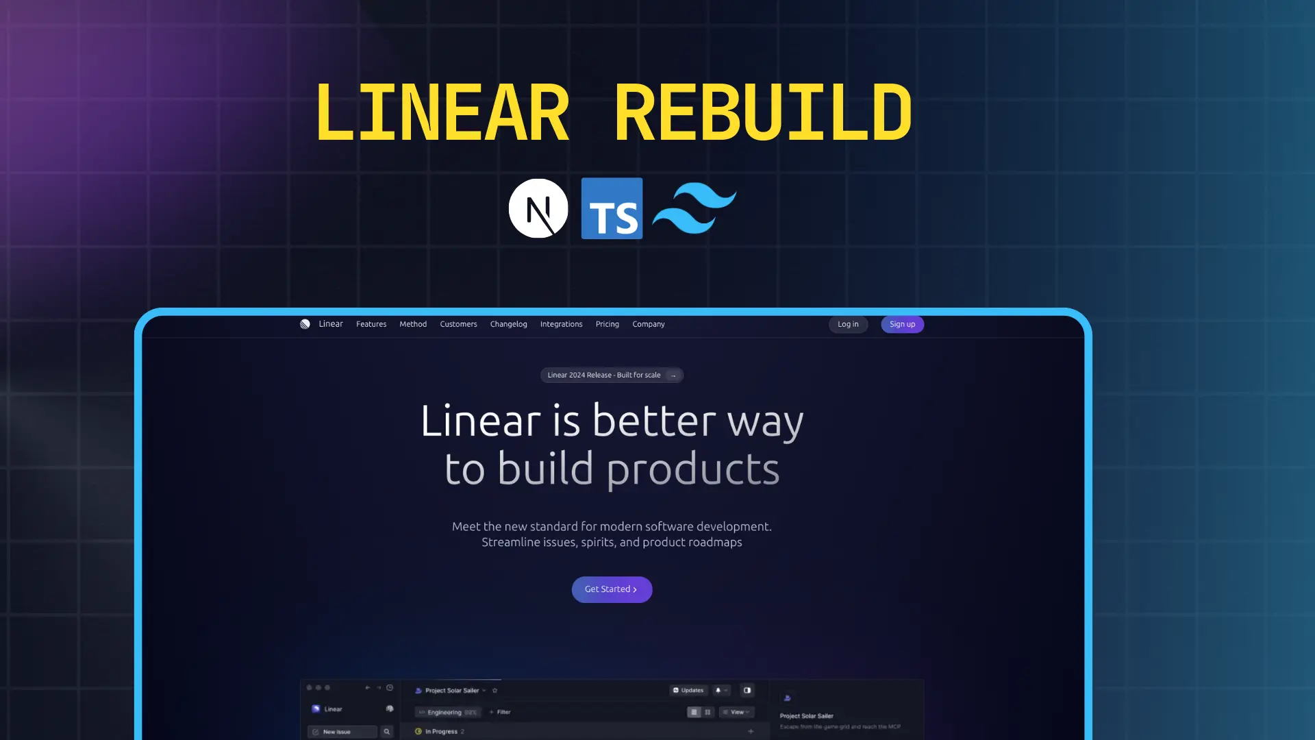
This project is a comprehensive recreation of Linear's official marketing website, focusing exclusively on the visual presentation layer. Linear is known for its exceptional design language and smooth user experience, making it an excellent reference for learning modern web design patterns.
What Makes This Project Special
The rebuild captures the essence of Linear's design philosophy through careful attention to detail in every aspect of the implementation. From the subtle animations to the precise spacing system, every element has been thoughtfully crafted to mirror the original while serving as a learning exercise in production-quality frontend development.
The project prioritizes clean code architecture, component reusability, and scalable styling patterns that can be applied to real-world commercial projects.
Core Objectives
Design Fidelity: Achieve pixel-perfect accuracy in recreating Linear's visual design, including typography scales, color palettes, spacing systems, and layout structures.
Responsive Design: Ensure seamless experiences across all device sizes, from mobile phones to ultra-wide desktop monitors, with thoughtful breakpoint implementations.
Performance Optimization: Leverage Next.js optimizations for fast page loads, efficient bundling, and optimal rendering strategies.
Code Quality: Maintain clean, readable, and maintainable code with TypeScript for type safety and better developer experience.
Features & Implementation Details
Hero Section
The hero section serves as the primary visual anchor, featuring a bold headline, compelling subheadline, and strategically placed call-to-action buttons. The layout uses a centered alignment with generous whitespace, creating a sense of focus and clarity.
Key implementation details include responsive typography that scales elegantly across breakpoints, gradient backgrounds that add visual depth without overwhelming the content, and smooth hover animations on interactive elements that provide tactile feedback.
Feature Showcase Sections
Multiple feature sections present Linear's product capabilities through a combination of descriptive text and supporting visuals. Each section alternates between left-aligned and right-aligned layouts to create visual rhythm and maintain user engagement throughout the scroll experience.
The sections incorporate icon systems, feature cards with subtle shadows and hover effects, and carefully orchestrated reveal animations that trigger as elements enter the viewport. The spacing between sections follows a consistent vertical rhythm that guides the eye naturally down the page.
Navigation System
The navigation bar implements a sticky header that remains accessible as users scroll, with smooth transitions between transparent and solid backgrounds. The mobile navigation transforms into a slide-out menu with smooth animations, ensuring usability on smaller screens without sacrificing the desktop experience.
Footer Architecture
A comprehensive footer section includes multiple column layouts organizing links by category, social media integration, newsletter signup forms, and legal information. The footer uses a darker color scheme to signal the end of content while maintaining brand consistency.
Typography System
The project implements a carefully calibrated type scale using modern sans-serif fonts, with distinct hierarchy levels for headings, subheadings, body text, and captions. Line heights and letter spacing are optimized for readability across different contexts.
Color Palette
The color system features a refined neutral base palette with strategic accent colors for interactive elements and calls-to-action. Dark mode support ensures the design works beautifully in both light and dark environments, with colors adjusted for optimal contrast and legibility.
Spacing & Layout Grid
A consistent spacing system based on multiples of 4px or 8px creates harmonious relationships between elements. The layout uses CSS Grid and Flexbox for robust, flexible positioning that adapts gracefully to different screen sizes.
Technology Stack Deep Dive
Next.js 16.0.10
App Router Architecture: Utilizes the modern App Router for improved routing, nested layouts, and enhanced data fetching patterns. This enables better code organization with layout components that persist across route changes.
Server Components: Leverages React Server Components by default for optimal performance, reducing JavaScript sent to the client and improving initial page load times.
Image Optimization: Employs Next.js Image component for automatic image optimization, lazy loading, and responsive image serving based on device capabilities.
SEO Optimization: Implements metadata API for search engine optimization, including dynamic meta tags, Open Graph images, and structured data for better discoverability.
Performance Features: Benefits from automatic code splitting, route prefetching, and optimized bundling that significantly reduce time-to-interactive metrics.
Tailwind CSS 2.4.0
Utility-First Approach: Uses Tailwind's utility classes for rapid styling without context switching between files, enabling faster iteration and easier maintenance.
Design System Integration: Customizes Tailwind's configuration to match Linear's design tokens, including custom color palettes, spacing scales, and typography settings.
Responsive Design Utilities: Leverages Tailwind's responsive modifiers for declarative breakpoint-based styling directly in markup.
JIT Compilation: Takes advantage of Just-In-Time compilation for on-demand CSS generation, resulting in smaller production bundles.
Component Extraction: Uses @apply directive judiciously for frequently repeated utility combinations while maintaining the utility-first paradigm.
TypeScript
Type Safety: Provides compile-time error checking that catches potential bugs before they reach production, significantly improving code reliability.
Enhanced Developer Experience: Enables intelligent autocomplete, inline documentation, and refactoring support in modern IDEs.
Interface Definitions: Defines clear contracts for component props, API responses, and configuration objects, making the codebase self-documenting.
Reduced Runtime Errors: Eliminates common JavaScript pitfalls like undefined property access and type coercion issues through static type checking.
Responsive Design Strategy
The project implements a mobile-first approach with four primary breakpoints: mobile (default), tablet (768px), desktop (1024px), and large desktop (1280px). Each breakpoint receives specific layout adjustments to optimize content presentation.
Navigation menus transform into hamburger-based mobile menus with smooth slide-in animations. Grid layouts shift from single-column stacks on mobile to multi-column arrangements on larger screens. Typography scales adjust to maintain readability without overwhelming smaller viewports.
Images and media use srcset attributes to serve appropriately sized assets based on viewport dimensions and pixel density, reducing bandwidth usage on mobile networks while maintaining visual quality on high-resolution displays.
Design Principles Applied
Visual Hierarchy: Clear distinction between primary and secondary information through size, weight, and color contrast guides users through content naturally.
White Space: Generous spacing creates breathing room that prevents cognitive overload and emphasizes important elements.
Consistency: Repeated patterns in spacing, colors, and component design create a cohesive experience that feels intentional and professional.
Accessibility: Sufficient color contrast ratios, semantic HTML structure, and keyboard navigation support ensure the site is usable by everyone.
Performance: Optimized assets, efficient code, and minimal render-blocking resources create a fast, smooth experience that respects users' time and bandwidth.
Purpose & Learning Outcomes
Technical Skills Development
This project served as a comprehensive exercise in modern frontend development, providing hands-on experience with production-grade tools and workflows. It reinforced understanding of component-based architecture, state management patterns, and performance optimization techniques.
Design Implementation Proficiency
Translating a polished commercial design into functional code required careful attention to visual details that often go unnoticed. This process developed skills in recognizing and implementing subtle design elements like micro-interactions, spacing relationships, and typographic nuances.
Problem-Solving Experience
Recreating complex layouts without access to original source code required creative problem-solving and deep knowledge of CSS layout systems. Challenges included reverse-engineering animation timings, determining responsive breakpoint logic, and matching color values precisely.
Portfolio Value
The completed project demonstrates capability to deliver production-quality work that matches professional standards. It showcases understanding of modern web development best practices and attention to detail that employers and clients value.
Live Demo & Repository
Live Site: View the deployed application
The site is hosted on Vercel's edge network, ensuring fast global delivery and automatic HTTPS. Every push to the main branch triggers automatic deployments with preview URLs for testing changes before they go live.
Future Enhancements
Potential improvements for future iterations include adding scroll-triggered animations using Framer Motion or GSAP, implementing dark mode toggle functionality, integrating a content management system for easier content updates, and adding accessibility features like screen reader optimizations and keyboard navigation enhancements.
Additional features could include performance monitoring with Core Web Vitals tracking, A/B testing capabilities for different design variations, and internationalization support for multi-language content delivery.
Key Takeaways
Building this clone reinforced the importance of starting with solid foundations in HTML structure and CSS layout before adding complexity. It highlighted how modern tools like Tailwind CSS and Next.js can accelerate development without sacrificing code quality when used thoughtfully.
The project demonstrated that achieving professional-looking results requires equal attention to technical implementation and design details. Small touches like consistent spacing, smooth animations, and thoughtful color choices make the difference between amateur and professional work.
Most importantly, the exercise proved that the best way to learn modern web development is through hands-on practice with real-world design challenges that push your understanding and force you to find solutions to complex problems.